2013年6月2日星期日

Field Trip - Bank Negara Museum ^^

I went to a field trip with my lecturers and classmates on 1st of June 2013. We went to Bank Negara Museum to do some research that is regarding on our final project.

The first impression I have towards the museum is"Wah!!So modern!!The design of the building is so classy and can let people feel like very modern feeling.The toilet it is really clean and nice.Because museum also let us feel like many images and text.But this museum is totally different with others museum and it is FREE for entry!

I found many things that is very interesting.The things that represents my impression is the children section.There have a lots of interaction as information,very colorful and children can easy understand!Children like to touch thing,there have some game can let them play and let them feel like they "own" the environment.

Use the crayon to draw the coin.


For the third floor which is the history part of Malaysia economy,much to my surprise,the display is so high-tech and has those interactivity stuffs and games.We learn NUI,TUI and etc in our Dynamic Interactive class last few weeks,the museum got a lots of this kind of technology,especially Natural User Interface (NUI).We visit in the Numismatic Gallery first. The first things we saw is the information of barter trade, its used in trading before money is used. There is an interactive game that let us experienced the barter trade in the gallery and it's difficult to trade without money. 

An interactive game that can let us experience the barter trade.

My learning experience of the museum is a good experience,the economy of Malaysia,the display have a lots of cubes,its represent an item.You can turn the cubes,it is show the price of the item in two different time,compare the price between past and present.think the information presented in an attractive way.


1960s RM70

2010s  RM200
1960s 25sen

2010s RM1.50

I think I will share the information from the museum to my friends.Because now is the "touch screen" generation,all the younger all are using touch screen things.This museum is full of NUI technology,I think they wont feel like boring and can use the interactive way to understand it!If the information full of text,I don't think they will read it.

If i would to ask more questions about Bank Negara, its money and history, it would be...


1.Why the coins are so small and it value so big?how they decide about it?
2. How early money improve efficiency in trading? 
3.How does malaysian think about the design of the notes and choose those theme as the design?

2012年8月15日星期三

我爱大家 


又sem break了,时间还过得真快。感情的事,我早已经看开;) 事情已经告一段落,回想起事情是发生在上一个sembreak,当时的我是多么的天真 ;p 
这个学期里又认识多两位好姐妹,那就是Calvin还有Sim,所以呢我有四个很要好的姐妹,Nini,Poh Yee,Calvin,Sim


Poh yee,Sim,Thong,Calvin,Queenie


Calvin还有Sim呢,虽然我们认识才几个星期,但是我们五个人的感情好得就像从小认识到大的那些死党。我们一起上课,一起下课,一起赶功课,一起熬夜,一起钓鱼,一起颓废,一起吃,一起大笑,一起睡觉。

Poh Yee:这个学期比较少听到她的爱情故事了,因为我直接听她跟她的爱人谈电话,听了真的有一股冲动想耳聋 ;p 哈哈哈 太肉麻了吧!但是很开心她是幸福的,老公很疼爱她。❤ 最顶不顺她就是做功课很爱慢慢摸,尤其是我们的web design!!!哈哈哈 就想跟你说,不要每次自己一个人emo,我懂你很伤心你总是不能参我们一起因为你家人不给,但是我们没有抛弃你,你永远都是我们的gang,我们的姐妹,okay? ;)) ❤ 最喜欢你就是很会安慰人,每次emo还是有什么事情都有时会跟你分享,分享心事给你听都很舒服,但是有时会给你piak那样咯!哈哈 ;p

在家玩化妆 ;p


Queenie:每个星期都抛弃我,因为她太想念她的家人还有男朋友,所以就抛弃我咯,但是我还是会原谅她,因为从星期一到四,我们天天见,也睡一起,我看也会腻吧 ;p 哈哈哈。有时我们一个发癫就会出去享受,即使知道功课很多,但是开心就好 ;p ❤ 有时很不明白她脑装什么,web design还有flash都很厉害一下,每次功课不会,她都很愿意教我们几个不会的叻。最后有一点给他磨练出来了,虽然还不是很会啦,但至少没有那么讨厌!;p 很喜欢她的家人,都很亲切,很梦幻,真的都很好人 哈哈哈 ;p Nini最近变坏了,她怪我教坏她叻,你说我伤心吗?;(( 谁可以救我?;p 


Calvin:斯斯文文的样子骗到我了,原来他pattern多到不能顶,笑死人 哈哈哈!!!他很爱欺骗我叻,但是有时他又很好人一下,就一下而已啦 ;p 他的性格之类的都跟我蛮像的叻,他是怪人,我也是怪人,所以大家一起怪,所以大家总是一起配合。;p 他很疯狂,很爱做女生做的东西,比如涂指甲油,化妆之类的,他都不懂自己有几“狗”!哈哈哈 还有就是总是要他决定吃什么 ;p 他带我们去吃面粉糕,吃了一次就有很多的下一次了,太好吃了 ;p 他最近越来越坏了,一直钓鱼,学到poh yee了。但是每次听他说不要做功课了,去睡觉了,结果每次去到学校,他的功课都是差不多要做完了的!!!CALVIN你觉得你对吗每次欺骗我们的感情!!!><

化妆帅吗?;p

Sim:他是个调皮的小孩,每次做功课都是他坐我隔壁,有时很专心在做功课的时候,他突然间拿他的笔插人家的腋下“ka let dei”,有一次就是弄了大家,自己拿那个笔来吃,所以他就是吃了大家的ka let dei味道 哈哈哈!!!活该 ;p 他样子还蛮不错对吧?第一次见他时觉得他超拽的!!!看到我跟nini好像当看不到那样!你很贱叻! ;p

在mcd赶功课><


还有就是姐妹们的家人都很好,由于我hometown很远,一个sem只能回一次,所以都没有回然后去姐妹家 ;p 每次nini抛弃我,我就去calvin家,一起假假做功课,一直找东西吃,因为不想做功课又不想有罪恶感,,所以吃东西是最好的~这个是nini教的 哈哈哈 ;p 就这个sem还认识了一些很不错的senior,总是教我功课,总是给我鼓励,还很真的很感谢他的。;')


这就是我们的生活点滴 ^^v

2012年5月17日星期四

Project Initial Ideas-How to....

These are my project initial ideas. I have come out with 3 different ideas.


1.How to become pretty on the inside and out
 -Have self confidence
 -Remember to be true to yourself
 -Dont forget who you are
 -Dont get hung up on the flaws and focus on what you like about yourself.


2.How to be happy in a relationship
 -Tell him compliments
 -Always support your man
 -Take a good care of him
 -Learn to cook something


3.How to mix and match
 -Do not buy duplicates of the same basic color
 -Find out what kind of color suit your skin tone
 -Determine what kind of dressing suits your normal lifestyle 
 -Wise use of accessories also an important tool

4 screenshots on Photoshop/Illustrator tutorial websites....

1.How to create  this "into the wild"photo manipulation in photoshop
(URL:http://photoshoptutorials.ws/photoshop-tutorials/photo-manipulation/how-to-create-this-qinto-the-wildq-photo-manipulation-in-photoshop.html)


2.Apply Pro Photo Effects with photoshop CS6's Colour Lookup Adjustment
(URL:http://photoshoptutorials.ws/photoshop-tutorials/photo-effects/quick-tip-apply-pro-photo-effects-with-photoshop-cs6s-color-lookup-adjustment.html)


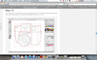
3.Create a Sketchy Hand-drawn camera illustration in illustrator
(URL:http://vector.tutsplus.com/tutorials/illustration/create-a-sketchy-hand-drawn-camera-illustration-in-illustrator/)


4.Create a Magical vector landscape using illustrator-vector premium tutorial.
(URL:http://vector.tutsplus.com/tutorials/illustration/magical-vector-landscape/)


....4 screenshots on beautiful websites with analysis...♥

I had searched many beautiful websites.Here is some screenshots of 4 beautiful websites that I liked and the analysis I had made for the websites.


1.Meomi
(URL:http://www.meomi.com/)

Analysis:-cool concept,based on a house
-very cute design
-cute character design
-2D design
-The typo is easy to be seen
- Motion graphic is added to make the site more alive.


 2.WebbliWorld
 (URL:http://www.webbliworld.com/)


Analysis:-very cute design
-cute character design
-2D vector design
- Typo match with the theme
-Interesting feedback


3.Anna Sui
 (URL:www.annasui.com)


Analysis:
-very classic feel
-elegance
-cool design,based on a room
-little fairy pointer instead of the classic normal pointer
-Nice loading page

4.chrisjockey
 (URL:http://www.chrisjockey.com/espaniol/home.html)


Analysis:
- simple design with interesting 2D vector
- Interactive
- Interesting loading page
- Typo is clear to be seen


2012年1月19日星期四